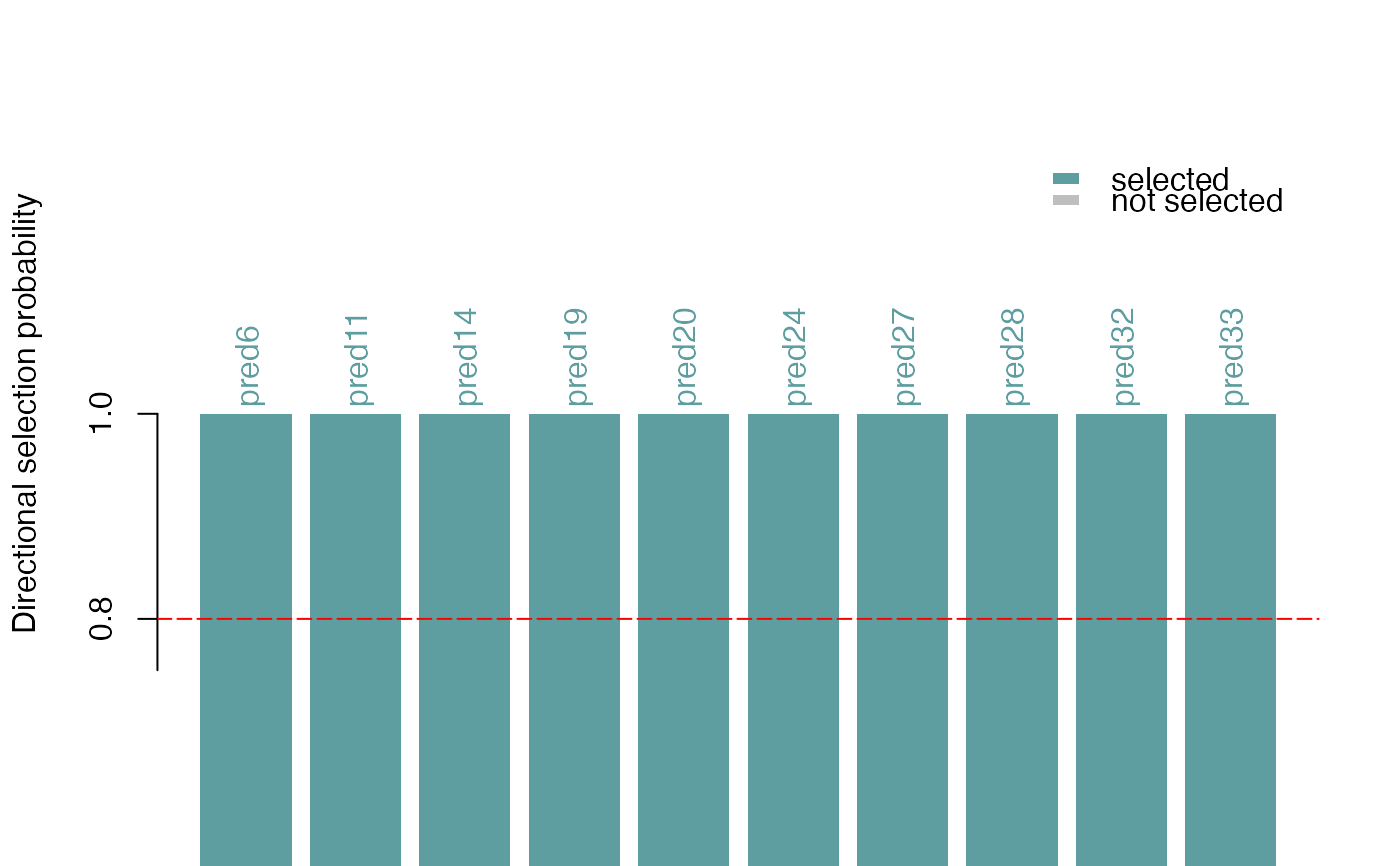
This function plots the selection probabilities of predictors (for example the selected motifs), optionally multiplied with either +1 or -1 to give a sense of both the strength and the directionality of the associated effects. The directionality is estimated from the sign of the correlation coefficient between each predictor and the response vector.
Arguments
- se
The
SummarizedExperimentobject with the results from stability selection (typically returned byrandLassoStabSel).- directional
A logical scalar. If
TRUE, selection probabilities are plotted with the sign of the marginal correlation between a predictor and the response.- selProbMin
A numerical scalar in [0,1]. Predictors with a selection probability greater than
selProbMinare considered selected and colored by the input fromselColor. By default,selProbMinis extracted from the parameters stored inse.- selProbMinPlot
A numerical scalar in [0,1] less than
selProbMin. Predictors with a selection probability greater thanselProbMinPlotbut less thanselProbMinare shown as bars with color defined innotSelColor.selProbMinPlotis useful in order to include additional predictors in the barplot, that were not selected according toselProbMinbut may be close to that cutoff or are simply nice to visualize alongside the selected predictors. SettingselProbMinPlot = 0will include all predictors.- showSelProbMin
A logical scalar. If
TRUE, the value ofselProbMinis shown by a horizontal line with the color defined byselProbCutoffColor.- selColor
Color for the selected predictors which have a selection probability greater than
selProbMin.- notSelColor
Color for the rest of the (unselected) predictors which will be show in the barplot.
- selProbCutoffColor
Color for the line depicting the selection probability cutoff.
- method
A character scalar with the correlation method to use in the calculation of predictor-response marginal correlations. One of "pearson", "kendall" or "spearman" (see
cor).- ylimext
A numeric scalar defining how much the y axis limits should be expanded beyond the plotted probabilities to allow for space for the bar labels. This value can be increased if the predictor names above the bars are too long and not showing in the plot.
Details
This function creates a bar plot with ggplot.
Each bar corresponds to a predictor (motif) and the colors correspond to
whether or not it was selected. The y-axis shows the selection
probabilities (directional=FALSE) or selection probabilities with
the sign of the marginal correlation to the response
(directional=TRUE).
Examples
## create data set
set.seed(321)
Y <- rnorm(n = 500, mean = 2, sd = 1)
X <- matrix(data = NA, nrow = length(Y), ncol = 50)
for (i in seq_len(ncol(X))) {
  X[ ,i] <- runif(n = 500, min = 0, max = 3)
}
s_cols <- sample(x = seq_len(ncol(X)), size = 10,
  replace = FALSE)
for (s in s_cols) {
  X[ ,s] <- X[, s] + (Y + rnorm(500, 0, 4)) * ifelse(s %% 2, -1, 1)
}

## reproducible randLassoStabSel() with 1 core
set.seed(123)
ss <- randLassoStabSel(x = X, y = Y)
plotSelectionProb(ss)