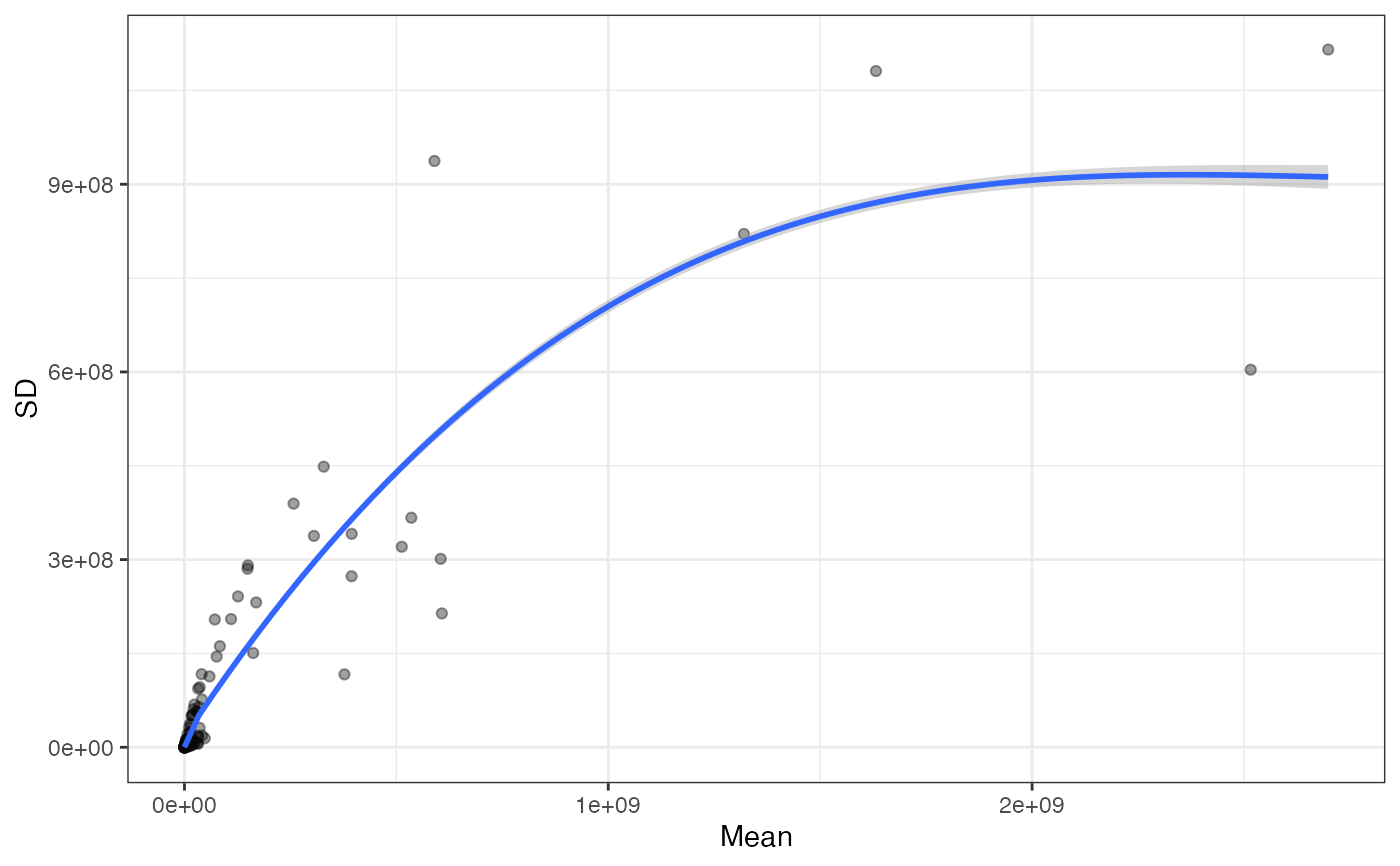
Make mean-vs-SD plot
makeMeanSDPlot.RdConstruct a plot of the mean abundance (x) vs the standard deviation of the abundance for each feature.
makeMeanSDPlot(sce, assayName, xlab = "Mean", ylab = "SD")Arguments
Value
A ggplot object.
Examples
mqFile <- system.file("extdata", "mq_example", "1356_proteinGroups.txt",
                      package = "einprot")
out <- importExperiment(inFile = mqFile, iColPattern = "^iBAQ\\.")
makeMeanSDPlot(out$sce, assayName = "iBAQ", xlab = "Mean", ylab = "SD")
#> `geom_smooth()` using method = 'gam' and formula = 'y ~ s(x, bs = "cs")'
#> Warning: Removed 72 rows containing non-finite outside the scale range
#> (`stat_smooth()`).
#> Warning: Removed 72 rows containing missing values or values outside the scale range
#> (`geom_point()`).
